花のカレンダーのための絵
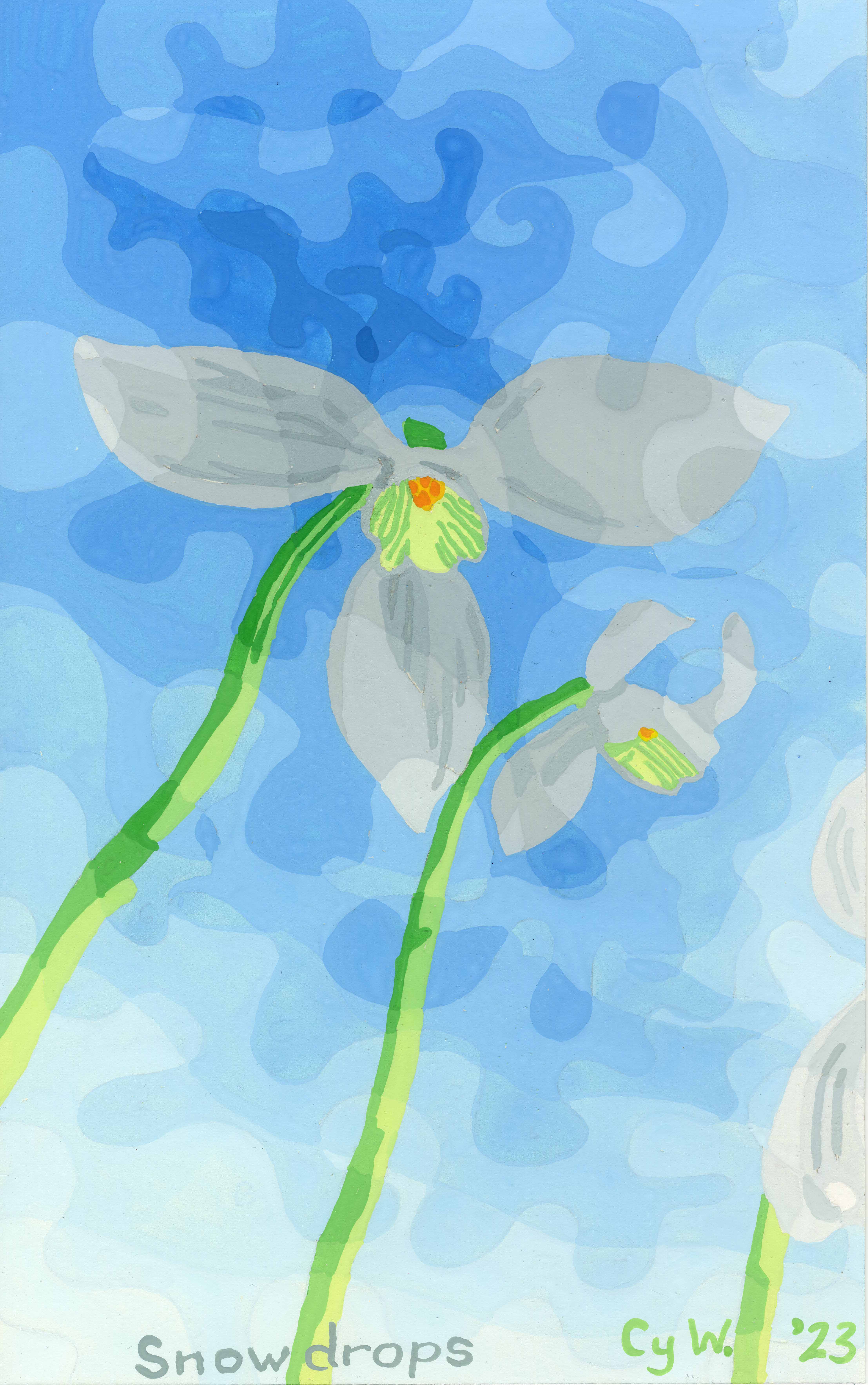
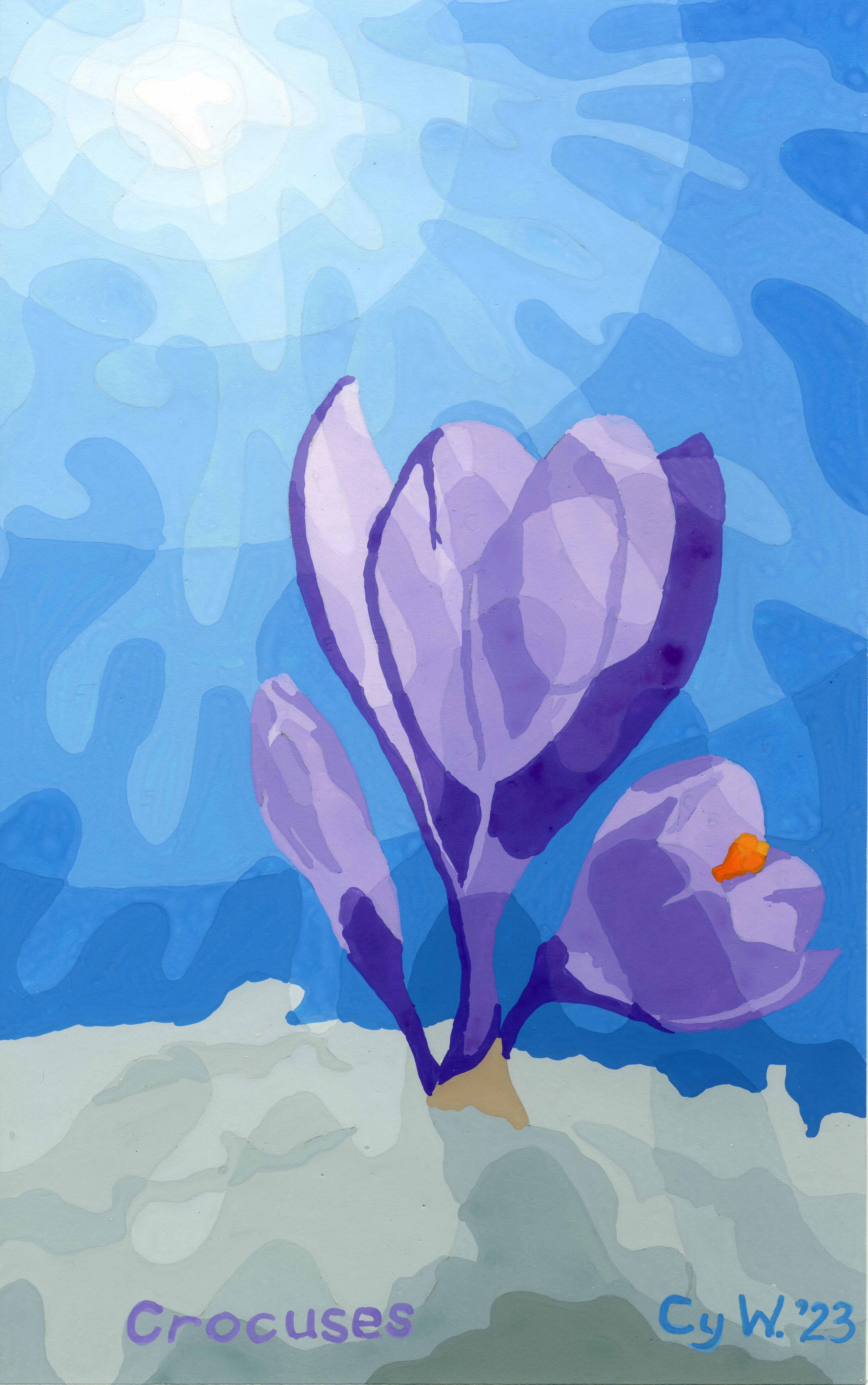
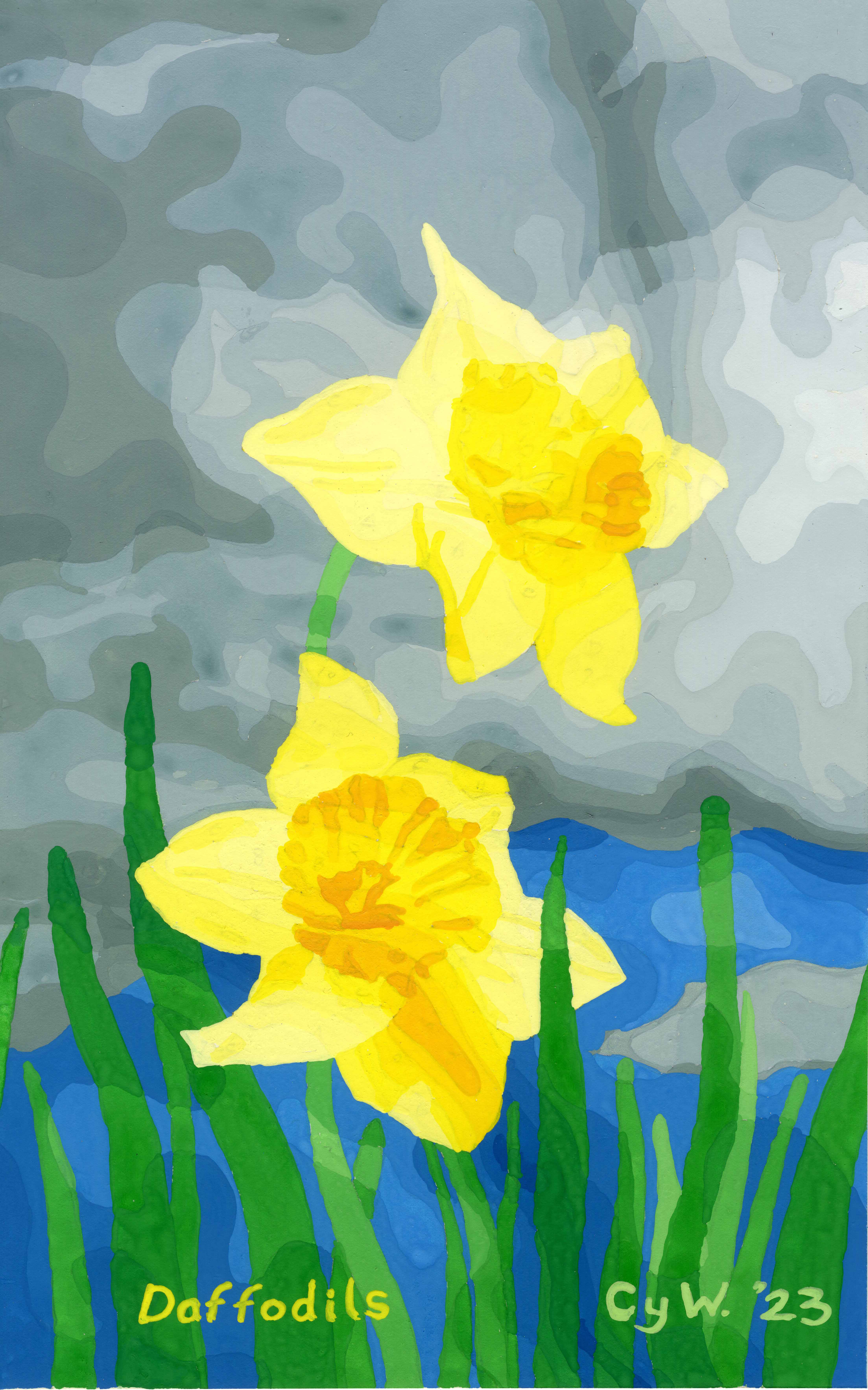
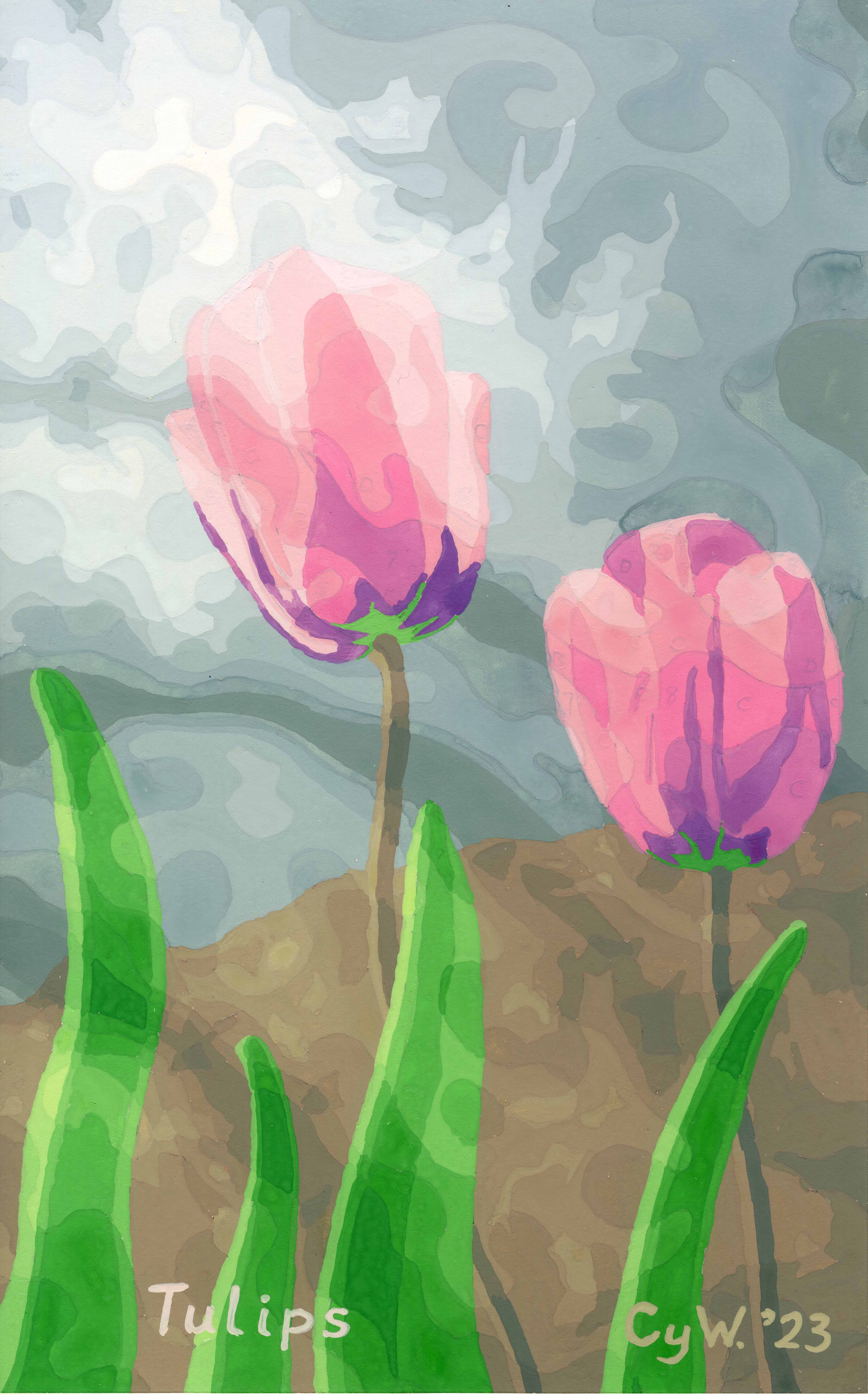
夏休みの間、来年のカレンダーの絵を完成しました。最初の四つは「Flowers for Spring’」
の所で見せました。
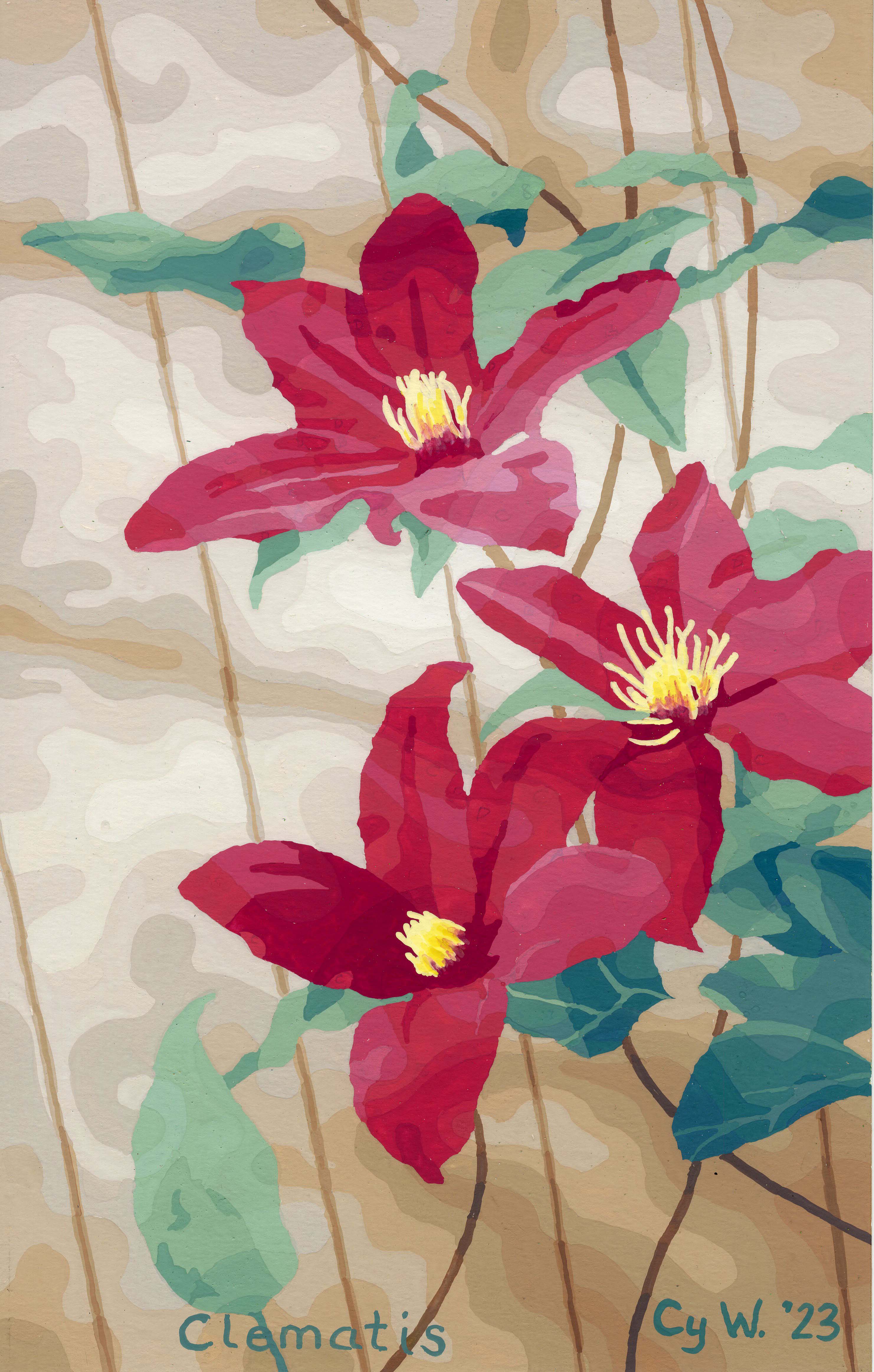
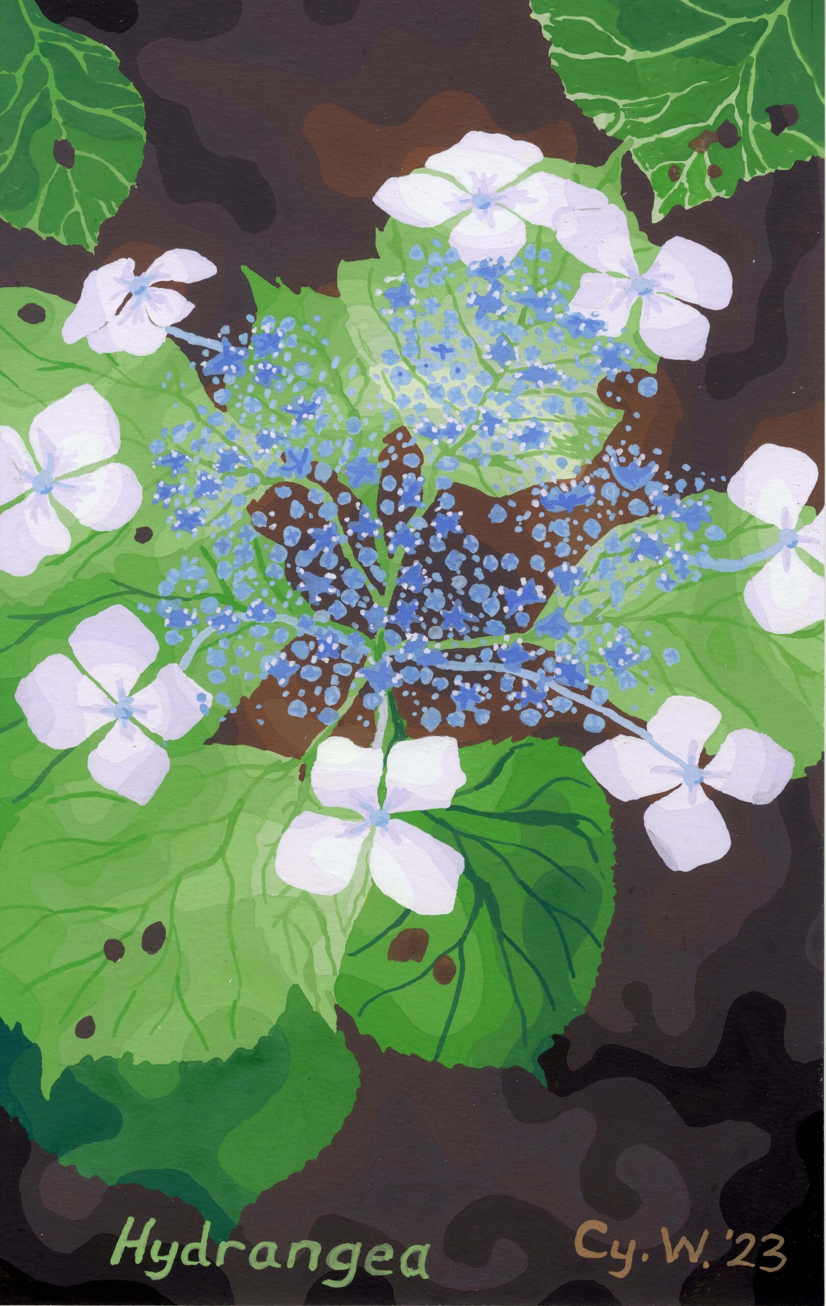
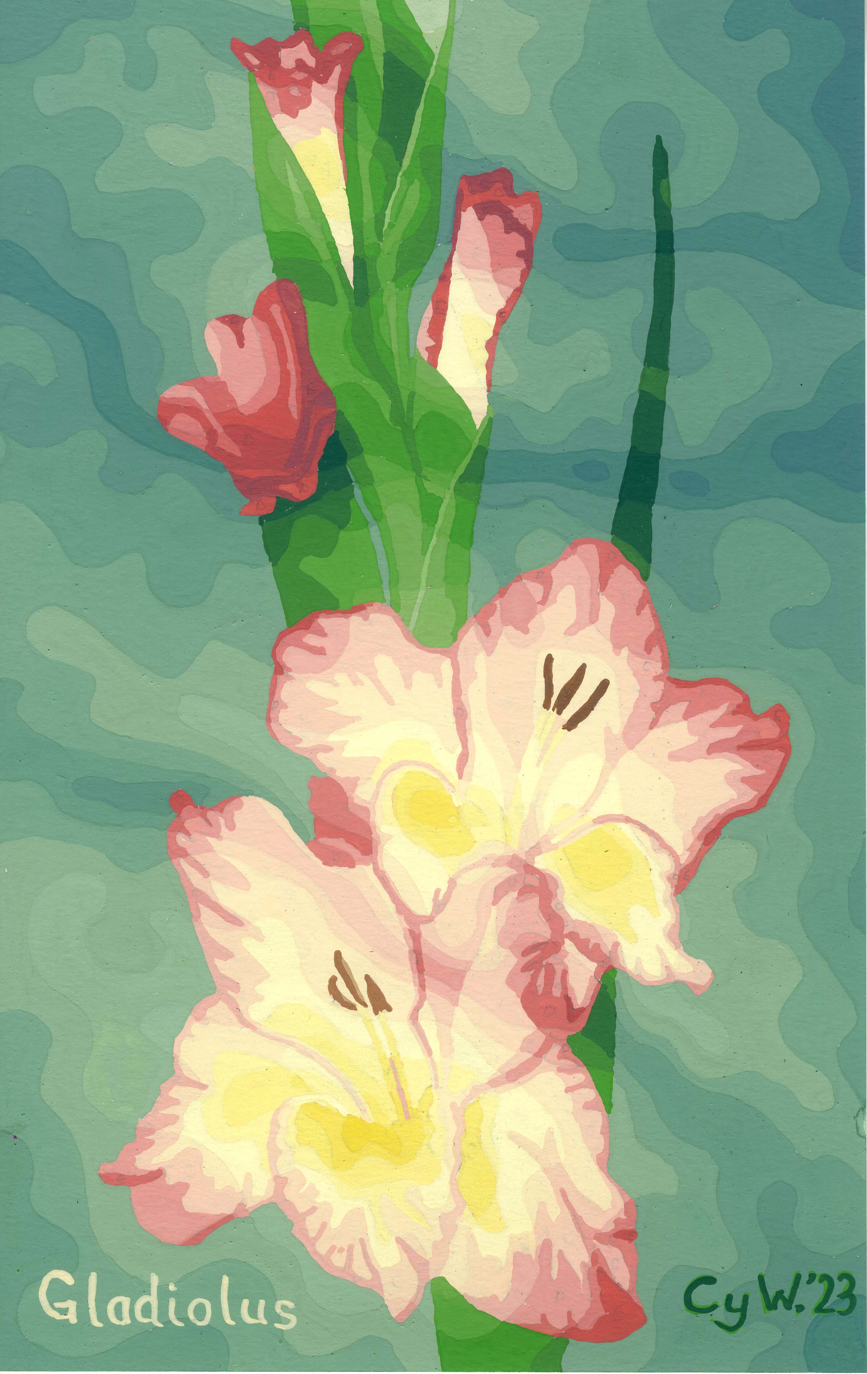
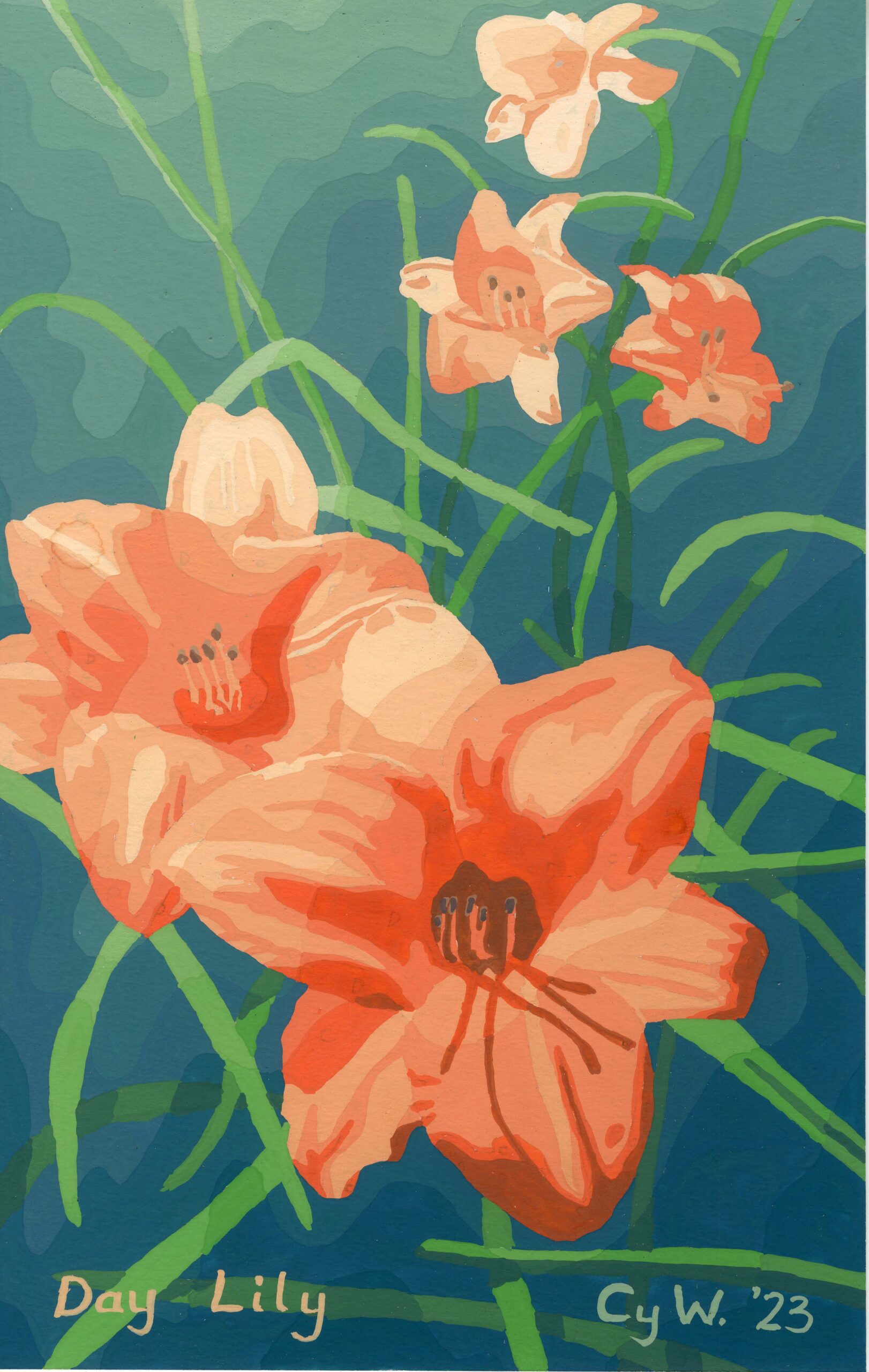
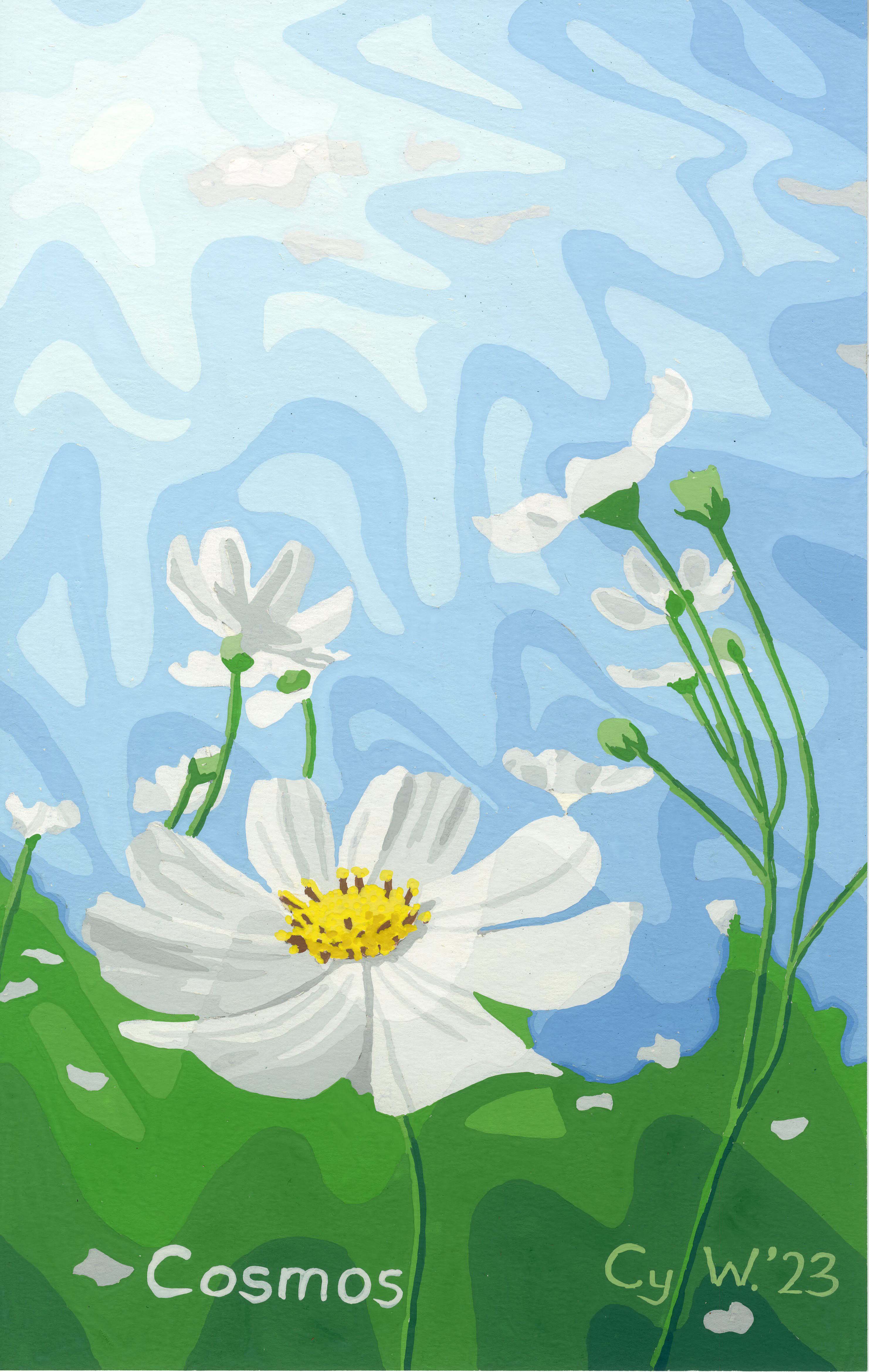
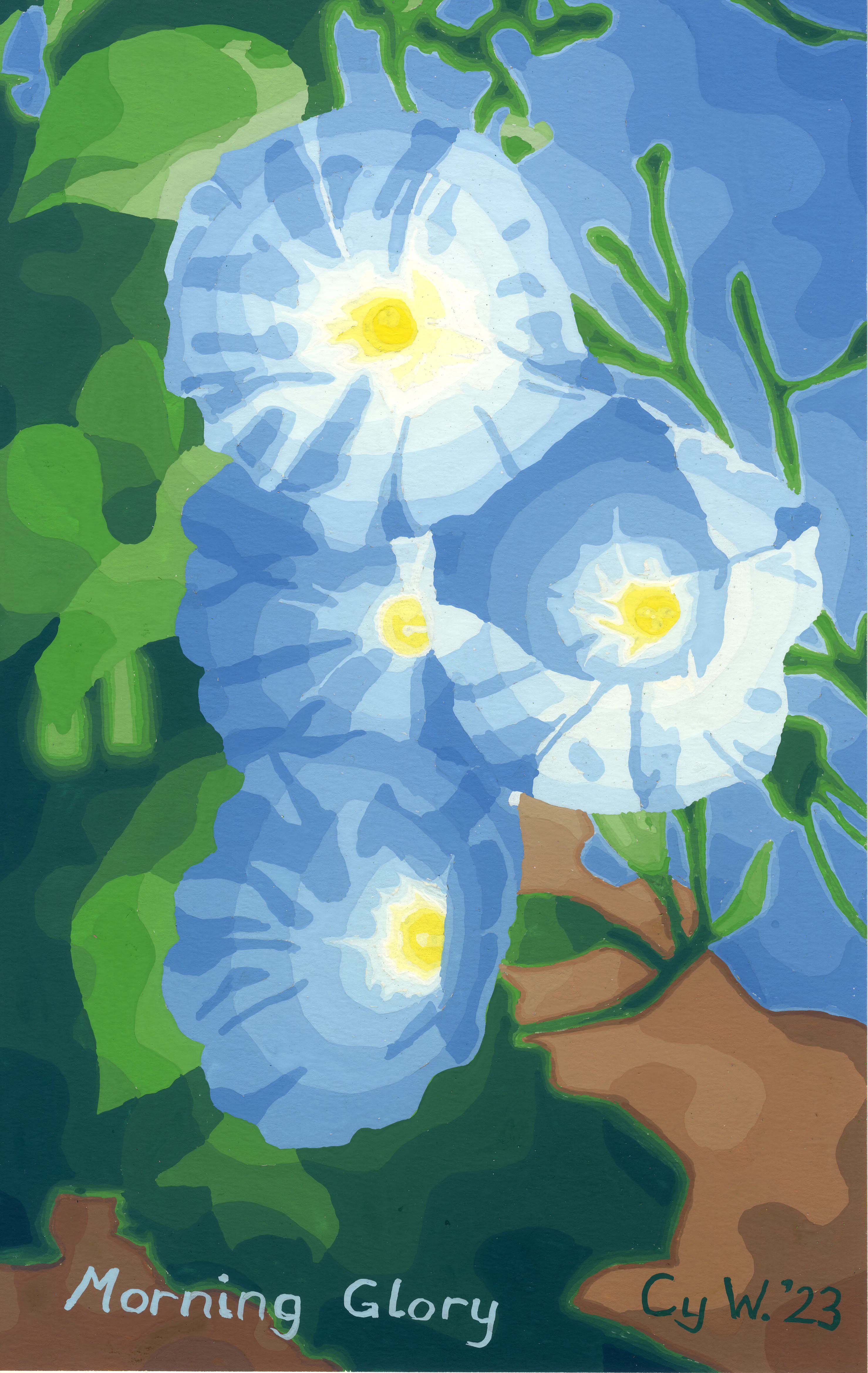
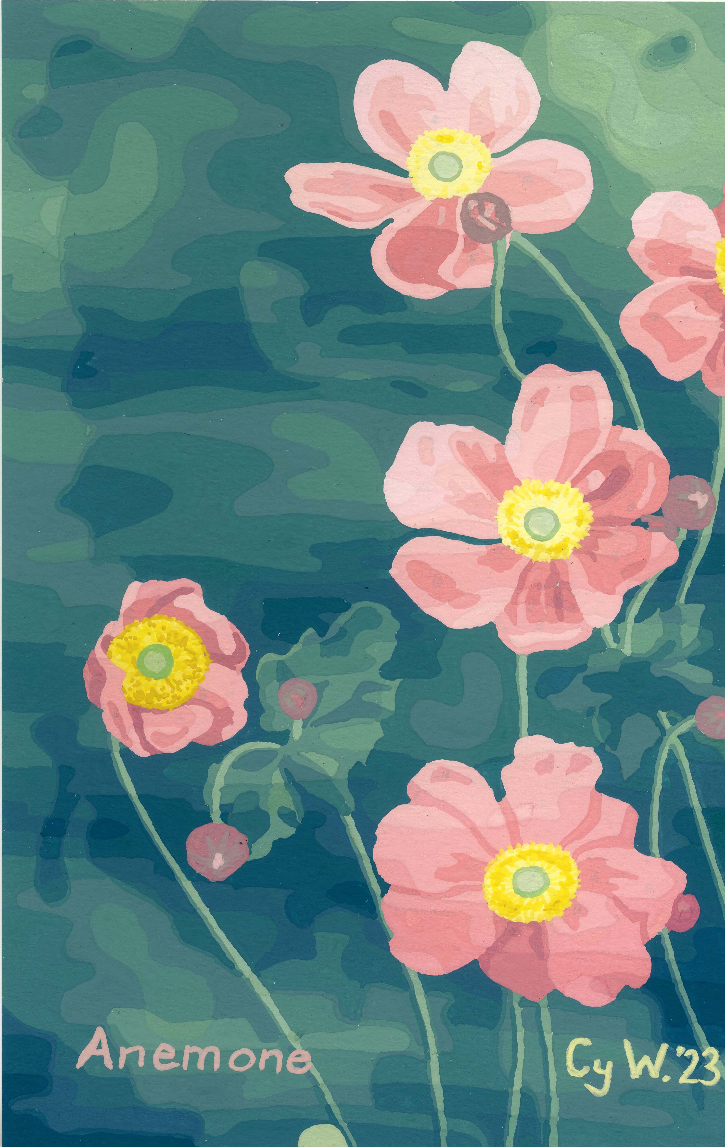
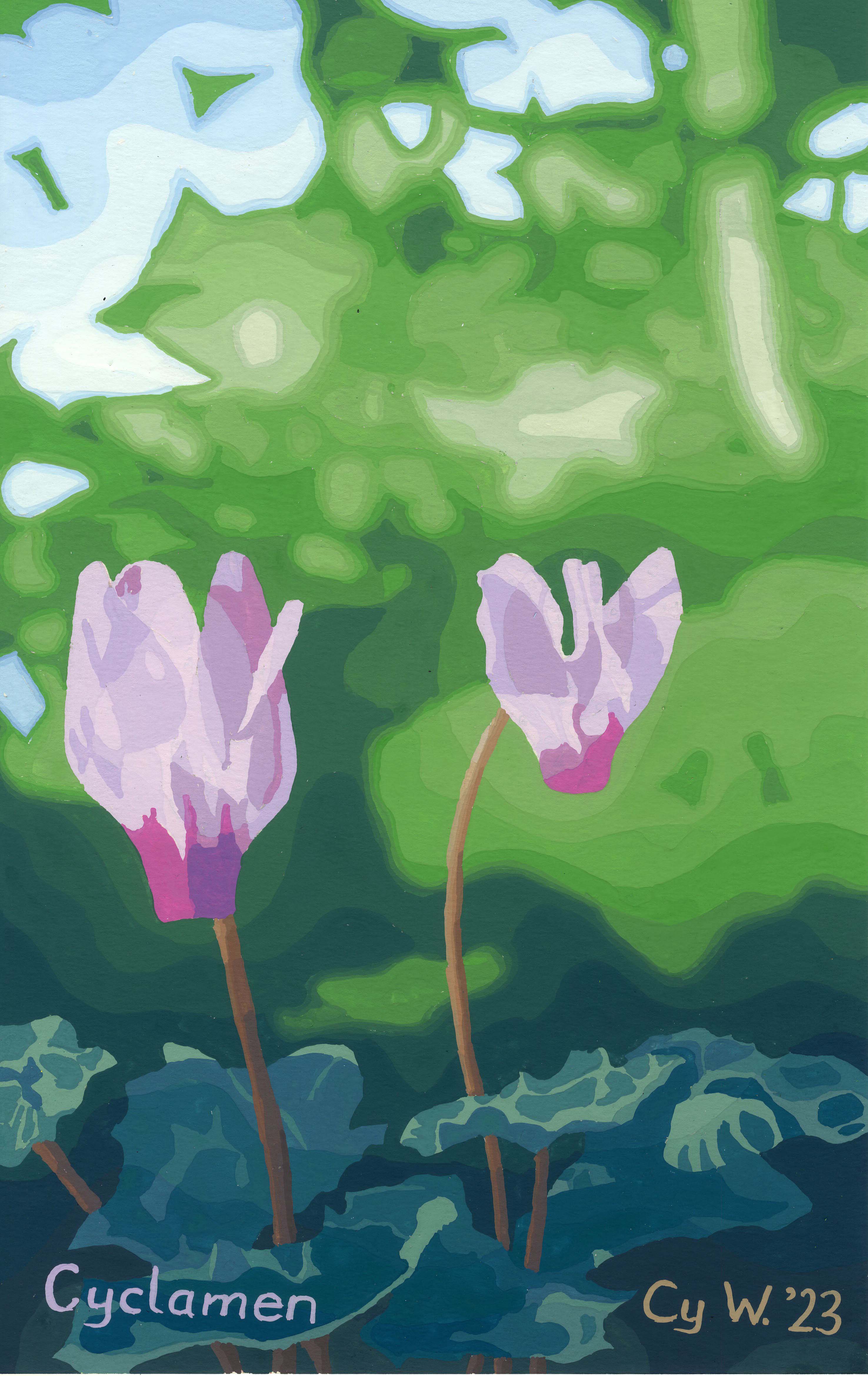
During the summer break I completed my paintings for next year’s calendar. The first four I presented in the spring under the name ‘Flowers for Spring’.
では、こちら。Here they are:
花のカレンダーのための絵
夏休みの間、来年のカレンダーの絵を完成しました。最初の四つは「Flowers for Spring’」
の所で見せました。
During the summer break I completed my paintings for next year’s calendar. The first four I presented in the spring under the name ‘Flowers for Spring’.
では、こちら。Here they are:


I’m late.
Valentine is past; Mother’s Day is past, at least in the UK; even Easter has come and gone.
Life goes on. Even so, I want to add this post. Finally adding it is a miracle for me personally.
Recent life events have given me pause to value human life more. I want to thank God for the miracle of life, even plant life.
Please click Spring Flowers to view the other paintings.
I have painted a series of four paintings called “Four Seasons”.
Here I explain how I painted them.
Step 1: Draw a design based on a theme.
For ‘Spring’ I chose tulips. I viewed hundreds of images mainly posted on the internet by people who sell tulips. Below is the finished design.
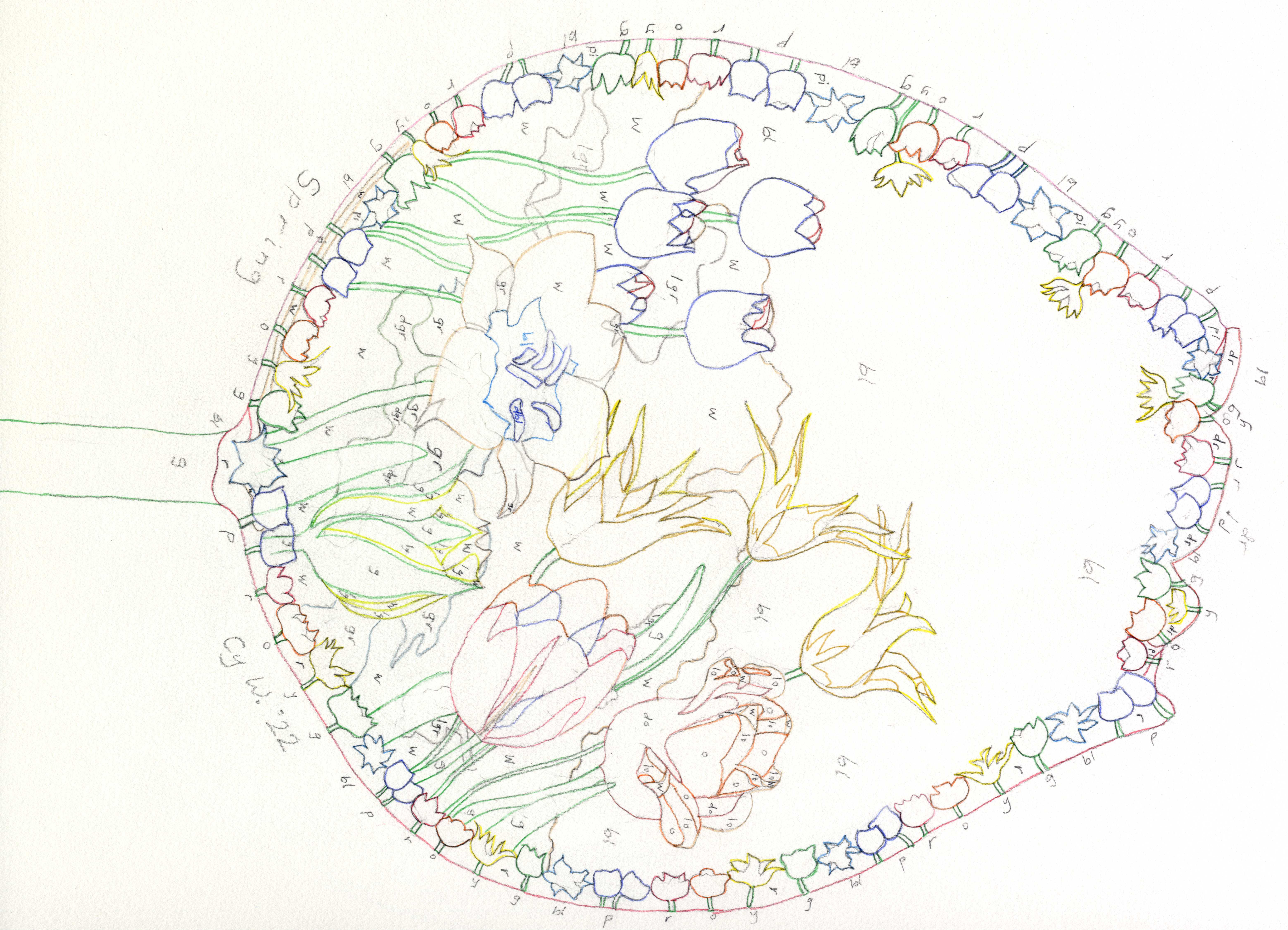
Each code represents a colour. The first is ‘dp’ or ‘deep purple’. Much later is ‘y’ or ‘yellow’. Last came ‘gr’ or ‘grey’. I basically paint by numbers. Deep purple, being the first colour, is given a ‘shift’ of zero. Yellow is given a shift of 36. The last colour to go on was grey with a shift of 84.
Step 2: Add a doodle.
Below is the finished doodle.
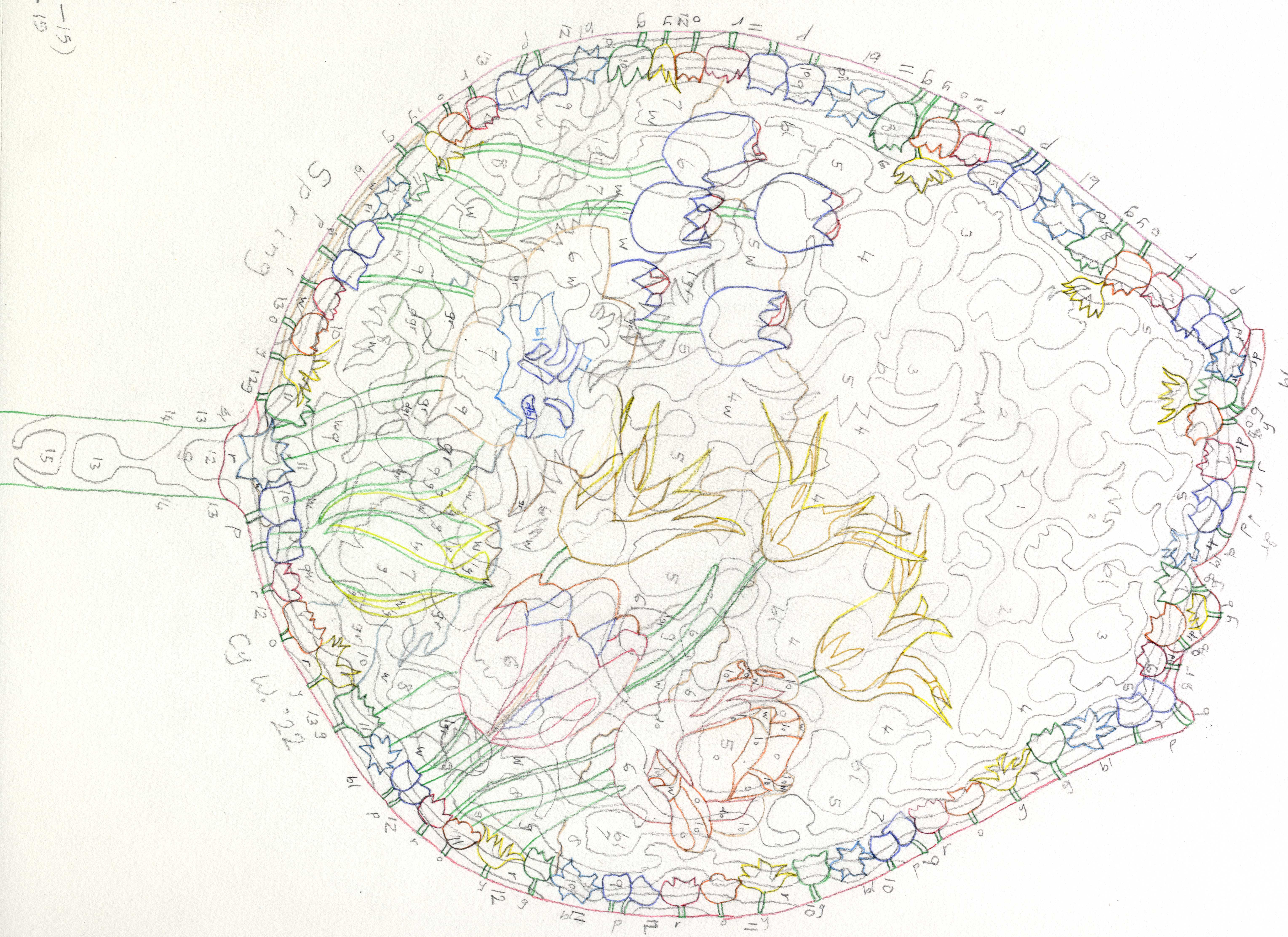
This doodle affects the colour balance. The higher the number of a band, the greater the ‘red shift’. That is to say colours are pushed towards the red end of the spectrum. This can lead to weird effects such as yellow tulips getting tinged orange. Red gets darker and turns brown; White becomes grey, useful for clouds.
Step 3: Paint, one colour at a time.

The band number of the doodle is added to the shift number of the colour area to determine the number of the colour needed. For example the first colour painted was the dark purple of the large tulips in the foreground. The shift was zero, and the band number was four, so the number needed was four, visible in the sequence above at the top right corner.
The result, hopefully, is a nice painting as featured below:
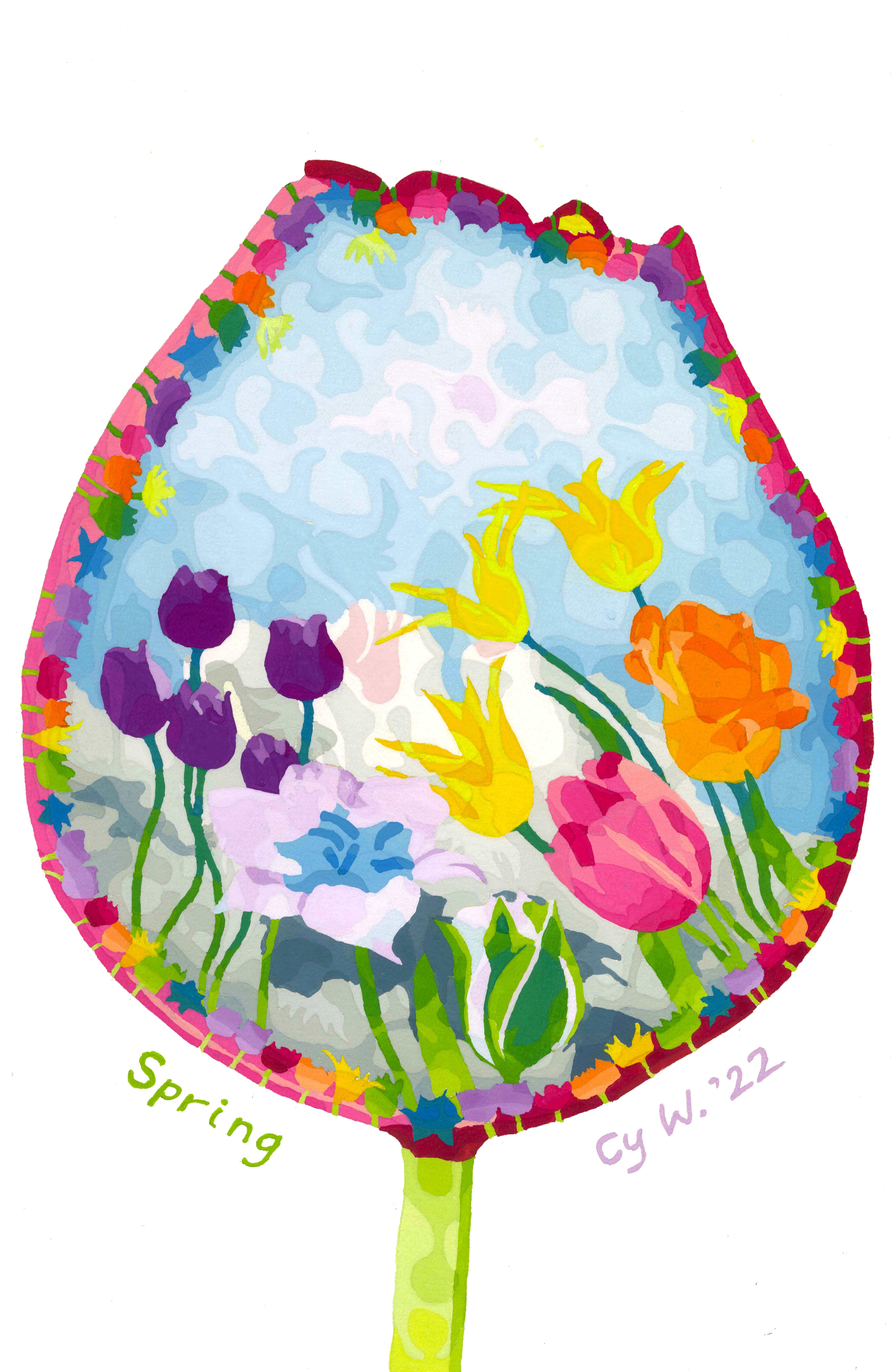
All 91 colours used in the series had to be preserved until all four paintings were completed. Why? Inevitably omissions occur. If the required colour is still sitting in the palette, it can easily be watered and applied. One advantage of gouache paint is that, like viruses, it just needs water to come to life again.
The whole series of completed paintings may be viewed in ‘Galleries’ then ‘Four Seasons’, or by clicking http://www.cysarts.com/?page_id=1579.
I hope you enjoy these paintings as much as I enjoyed painting them.
I realise these are late for the day, but they make good Mothers’ Day gifts, too.
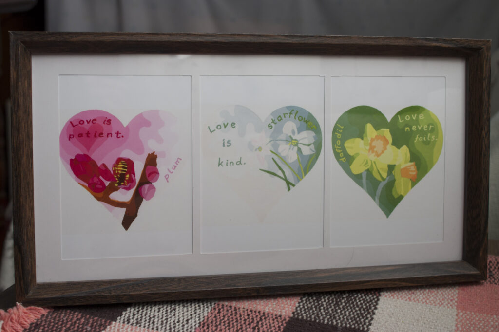
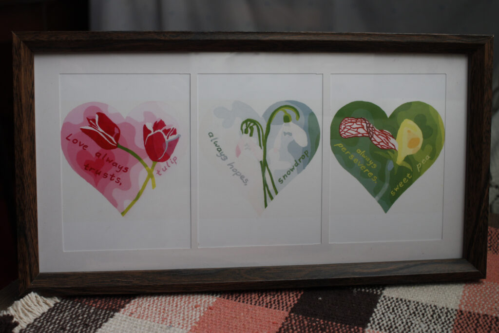
You can see larger images, as well as the original works of art, in Galleries, Valentine Hearts; or click on this link: http://www.cysarts.com/?page_id=1565.
I hope you like my hearts.
Peace Balloons 平和の風船
In the current coronavirus lockdown most of us have plenty of time. I have just completed Peace Balloons, possibly the most time-consuming art project I have ever undertaken, having invested an estimated 400 hours.
コロナウイルスのせいで、時間はたっぷりありますね。只今「平和のふうせん」の作品に役400時間をかけてやっと完成できました。
In the course of painting the nets my dear father passed away. At first I thought I stop painting. However it came to me that my father, who was an accomplished architect and painter, would have wanted me to continue. So I dedicate Peace Balloons to Cyril’s memory.
作品の実行途中、愛する父が亡くなりました。最初は作品をしばらくの間中断しようと考えた。しかし設計士であり画家である父の願いは、続くことだろうと感じた。だからこの作品を父の記念に差し上げます。
The post Peace Balloons 平和の風船 may be accessed here.
ここでもっと見れます。
Above is my papercraft bismuth. 上は私のペーパークラフトビスマス。蒼鉛(そうえん)あるいはビスマスは本当にすごいです。写真はhere、情報はここ、ペーパークラフトはこちらです。
Bismuth is really rather spectacular. Click here to see it in the flesh. Click wikipedia to get more info and images. Click more to see more images of my papercraft including the nets.
As ever, I hope you enjoy.
楽しんでください。
Olivine is usually green. It sometimes comes from space in a very colourful form in tiny spheres called chondrules in meteorites.
たいてい橄欖石 【かんらんせき】は緑です。時々隕石のコンドルールの中に色鮮やかな橄欖石が見れます。もっと詳しい情報はここ。顕微鏡のイメージはここ。
For more information see here. A microscope image may be seen here. Completed solids and nets may be viewed in Galleries → Papercraft → Crystals → Olivine, or by clicking here.
出来上がったペーパクラフトはGalleries → Papercraft → Crystals → Olivine で見れます。楽しんでください!
Enjoy!
蛍石の展開図です。出来上がったペーパクラフトはGalleries → Papercraft → Crystals → Hotaru Ishi で見れます。ここで鉱物の情報が見れます. 実物の写真はこち。楽しんで下さい。
These are the nets to make two crystals of Hotaru Ishi. Completed solids me be viewed in Galleries → Papercraft → Crystals → Hotaru Ishi. More information about the mineral may be found here; photos of the actual crystals are here.
Enjoy!
Despite the delicious name, this mineral is not edible. It has the features of watermelons if you except the seeds, sweetness and softness. It is a variety of tourmaline. Images of the actual mineral can be seen here—a page that sells jewellery.
More of my images, including the nets, can be viewed in “Galleries” → “Papercraft” → “Crystals” → “Watermelon Stone”.
Next week I hope to introduce a mineral that allegedly glows in the dark.
Enjoy!